Navigation is designed to help users get from point A to all other points on a site. And keeping the navigation menu in a fixed place enables users to navigate the site from anywhere on the page. Many websites 'stick' their main navigation to the top of the screen as the user scrolls down to explore content. Usability is an essential goal of any website, and usable navigation is something every website needs. It determines where users are led and how they interact with the website. Without usable navigation, content becomes all but useless. Menus need to be simple enough for the user to understand, but also contain the elements necessary to guide the user through the website — with some creativity and good design thrown in.
This has become easier thanks to CSS and jQuery plugins and many website themes now come with a sticky navbar as the default, and this trend is showing no signs on going anywhere. Consistent navigation and usability are both important, but the fixed navbar is also handy for mobile users, where the site is naturally longer and thinner.
If you have a site with lots of navigation items then it’s a good idea to keep it fixed. It’s a surefire way to keep visitors on the site for longer and increase total page views. Increasing numbers of websites are adopting the vertical navigation trend, and when it works it really works well. It's particularly popular on portfolios or creative agencies that push the boundaries of traditional web design.
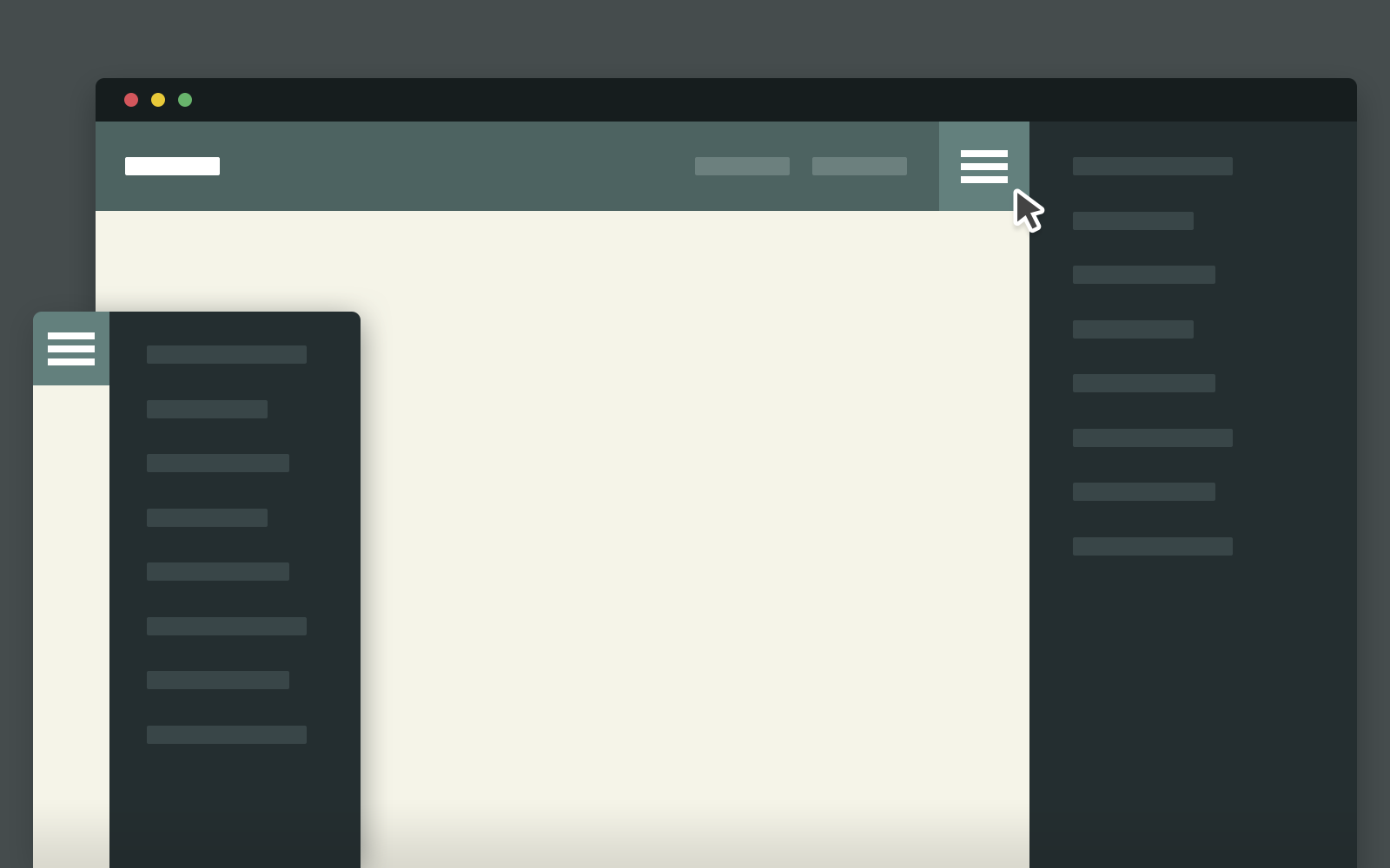
Every web designer should know about hamburger icons and their use in responsive design. When designing a website, there’s no way to avoid dealing with mobile navigation. It’s popular and it’s here to stay. Designers will often hide some navigation links on mobile to help the menu fit better on small screens. But many sites are following a new trend of keeping all navigation items by using drop-down menus. This usually requires a hamburger nav with toggle icons for link drop-downs.